Sizing
Introduction
In yeet, we focus on building responsive applications and provide several options to control how components are sized within your layouts.
How sizing in yeet works
The flex value (0, 1, 2, ...) defines how much space a flex item receives relative to its siblings inside the same flex container.
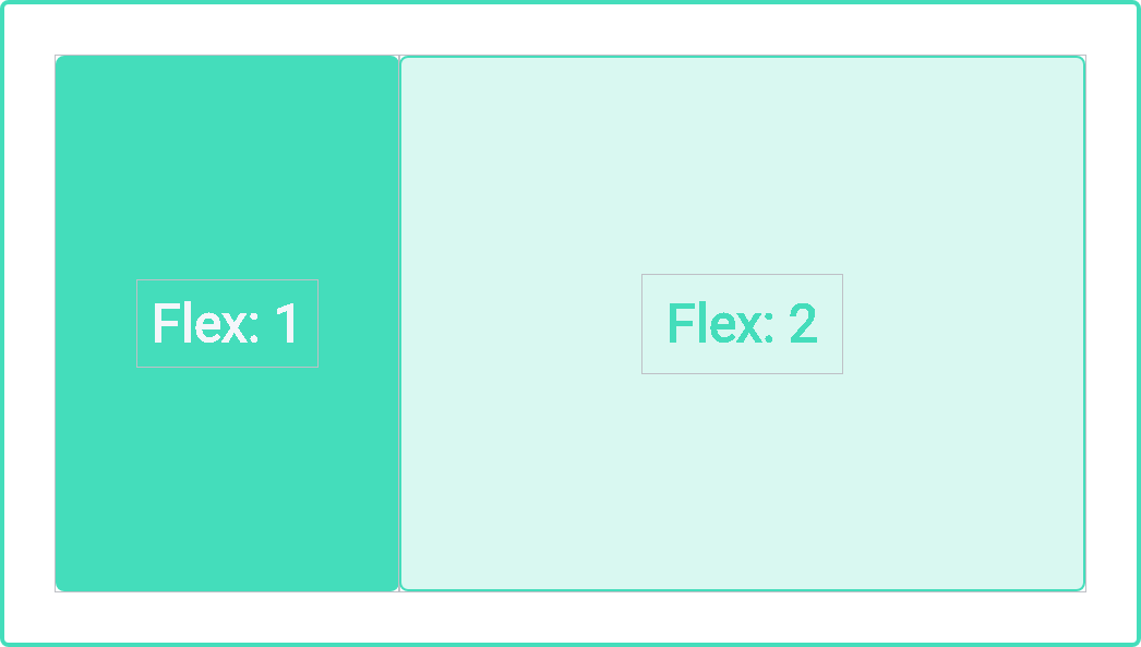
Example:
If a container has two flex items with flex values 1 and 2, the available space is divided in a 1:2 ratio.
This means:
- the first item will occupy roughly 33% of the available space,
- the second item will occupy roughly 66% of the available space.
You can also set flex to auto. In that case:
- the item is sized based on its width and height properties,
- it can grow to take up extra free space in the container,
- and it can shrink down to its minimum size to still fit inside the container.
If you use a flex value of 0 together with auto, the component’s size is primarily determined by its content when rendered.
The CSS properties min-width / min-height and max-width / max-height can be combined with the flex value.
They act as hard limits for how far a component may grow or shrink, even when the flex layout would otherwise give it more or less space.
For more details on CSS sizing concepts, you can refer to the MDN or other CSS documentation on width, height, min/max constraints and flex properties.