Layout System
Description
The yeet layout system is based on the Flexbox model but adds a number of simplifications on top.
The key difference is how the size of components is determined, while the core Flexbox rules still apply:
- Items are arranged in rows or columns.
- Items can expand to fill available space or shrink to fit into smaller spaces.
- Every component in yeet is a flex item.
- The components
yPage,yContainerandyPopupalways act as flex containers.
This combination forms the basis for building responsive, multi-platform web applications.
Main and Cross Axis Alignment
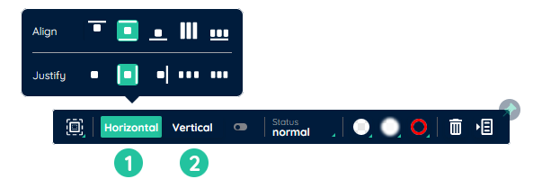
The main axis of a flex container is defined via the flex-direction property and defaults to column.
The cross axis is always perpendicular to the main axis.
So if the main axis is column, the cross axis is row, and vice versa.
Each axis has a start and end. The definition follows the standard western reading order:
- start: top / left
- end: bottom / right
(depending on whether the main axis runs vertically or horizontally)
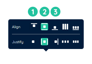
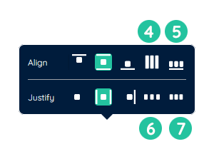
You control alignment along these axes with:
justify-content→ alignment along the main axisalign-items→ alignment along the cross axis
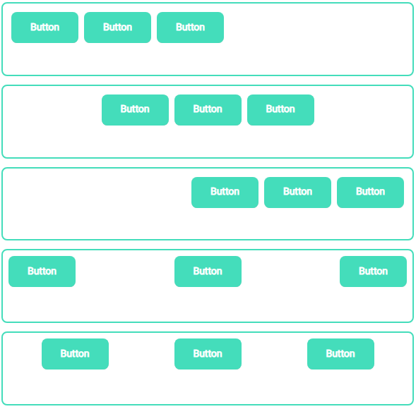
The following values are commonly used for these properties:
- flex-start
Place items starting from the axis start toward the end. - center
Place items centered, distributing them evenly to both sides. - flex-end
Place items starting from the axis end toward the start.
- baseline
Aligns flex items so their text baselines line up. - space-between
Distributes items so the free space is placed only between items, not at the edges. - space-evenly
Distributes items so the spacing between any two items and the container edges is equal. - space-around
Distributes items with equal space around each item, resulting in half the spacing at the container edges compared to spacing between items.
flex-wrap
The flex-wrap property specifies whether flex items are allowed to wrap onto multiple lines.
-
nowrap (default)
Items stay on a single line and will shrink to fit if necessary. -
wrap
Items wrap onto additional lines when they no longer fit into one line.
Nesting
Flex containers can be nested.
In this case, a child container:
- acts as a flex item in its parent (size, alignment, order rules of the parent apply), and
- at the same time acts as a flex container for its own children (with its own direction, alignment and wrapping rules).
This allows you to build complex layouts by combining simple flex containers.
Layout example
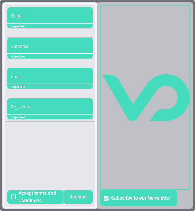
To create the layout shown above, you could follow these steps:
- Add two yContainer components into another yContainer (outer container).
Then add another yContainer into the left-hand container. - Set the
flex-directionof the left-hand subcontainers tocolumn
and theirjustify-contentvalues tospace-evenly. - In the upper left container: add a yInput for each required input field
and adjust the label of each field accordingly. - In the lower left container: add a yCheckbox and a yButton.
- In the right-hand container: add a yInput for each optional input field,
as well as a yCheckbox for the newsletter registration.