yTextarea
Description
The yTextarea component is designed for multi-line text input, offering extensive functionalities for text manipulation and display. It's particularly useful for cases where users need to input longer forms of text, such as comments, descriptions, or any other form of extended input.
Basic Structure
The yTextarea component is comprised of several parts, including the label, content area, hint text, and optional icons for additional functionalities. Here's a closer look at its basic structure:
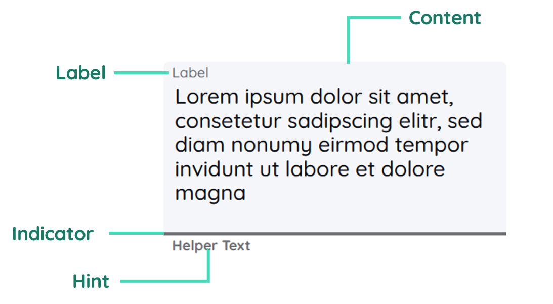
Label
Provides a title or description for the yTextarea, indicating what type of input is expected.
Content
The content is the main area where users can input their text. It can be resized to accommodate more content.
Hint Text
Offers additional guidance or examples to help users understand what they should input.
Properties
Through its various properties the yTextarea can be configured to suit your needs. The display below provides you with an overview of all the yTextarea properties.
Properties can be changed directly through three methods:
- Inside the Toolbar, which is positioned in your workarea next to your component right where you need it. It shows the most important properties, thus providing a fast and efficient way to configure your component in the most basic way.
- It may also occur in the Toolbar Extension, which is a seamless extension accesible as a dropdown item of the Toolbar. It extends the functionality of the Toolbar by providing advanced pickers for the most used properties.
- Inside the Detail Panel, which is located in the righthand drawer. Every property of a component can be configured here.
- Generic
- Style
- Textarea
- Links
- Events
METAread more
The identifier of the component that is unique within a page.
The type of the component. For this component it is -textarea.
The custom name of the component. It serves for better identification of the component.
The custom version of the Textarea-component. This can be used to ensure that all components work well together.
The CoreTheme, which will be apllied to the Textarea. For further information on themes visit the themes page.
The subtheme subordinated to the previously specified CoreTheme, which will be apllied to the Textarea. For further information on themes visit the themes page.
The group theme is a further variation of the subtheme which is specified especially for variations of a component inside the subtheme. For further information on themes visit the Theme-Manager page.
DISPLAYread more
This property specifies the display behavior of the component. This can be be set to:
- none
- block
- flex
- inline
This property specifies the type of positioning method used for the component. This can be be set to:
- static
- relative
- absolute
- sticky
- fixed
This property can toggle the visibility of the component. The two modes are completely hidden and fully shown.
SIZEread more
The minimum value for the width of the component. This can be set in:
- px
- pt
- em
- vw
- vh
- %
The minimum value for the height of the component. This can be set in:
- px
- pt
- em
- vw
- vh
- %
The value for the width of the component. This can be set in:
- px
- pt
- em
- vw
- vh
- %
- auto
The value for the height of the component. This can be set in:
- px
- pt
- em
- vw
- vh
- %
- auto
The maximum value for the width of the component. This can be set in:
- px
- pt
- em
- vw
- vh
- %
- none
The maximum value for the height of the component. This can be set in:
- px
- pt
- em
- vw
- vh
- %
- none
The flex property sets the length on flexible items. This sets the value in n-fold shares extrapolated to all other components with the flex display within the same container.
PLACEMENTread more
This property creates a space around the component, outside of the top border. This can be set in percent or pixels.
This property creates a space around the component, outside of the right border. This can be set in percent or pixels.
This property creates a space around the component, outside of the bottom border. This can be set in percent or pixels.
This property creates a space around the component, outside of the left border. This can be set in percent or pixels.
This property creates a space within the component, inside of the top border. This can be set in percent or pixels.
This property creates a space within the component, inside of the right border. This can be set in percent or pixels.
This property creates a space within the component, inside of the bottom border. This can be set in percent or pixels.
This property creates a space within the component, inside of the top border. This can be set in percent or pixels.
BACKGROUNDread more
The color of the background. This can be set as a color from a palette or a custom hex color.
BORDERread more
The color of the top border. This can be set as a color from a palette or a custom hex color.
The style of the top border. This can be be set to:
- solid
- dotted
- dashed
- none
The width of the top border. This can be set in percent or pixels.
The color of the right border. This can be set as a color from a palette or a custom hex color.
The style of the right border. This can be be set to:
- solid
- dotted
- dashed
- none
The width of the right border. This can be set in percent or pixels.
The color of the bottom border. This can be set as a color from a palette or a custom hex color.
The style of the bottom border. This can be be set to:
- solid
- dotted
- dashed
- none
The width of the bottom border. This can be set in percent or pixels.
The color of the left border. This can be set as a color from a palette or a custom hex color.
The style of the left border. This can be be set to:
- solid
- dotted
- dashed
- none
The width of the left border. This can be set in percent or pixels.
The radius of the corners of all the borders. This can be set in percent or pixels.
SHADOWread more
The shadow of the component. This is set by the 4 sub-properties x, y, blur and spread of the shadow-property, which can be further read about in the shadow-property section.
OPACITYread more
The opacity of all colored parts of the component. This value is set in percent.
LABELread more
The color of the label text. This can be set as a color from a palette or a custom hex color.
The font-family of the label text. This can be picked from a large list of provided fonts.
The font-weight of the label text. This can be set in a custom number, as example:
- 400 = normal(regular)
- 500 = medium
- 600 = semi bold
- 700 = bold
The font-style of the label text. This can be set to normal, italic or oblique.
The text-transformation of the label text. This can be set to:
- capitalize
- uppercase
- lowercase
- none
- full-width
The text-decoration of the label text. This can be set to:
- strikethrough
- underline
The font-size of the label text. This can be set in: -cm
- mm
- in
- px
- em
- ex
- ch
- rem
The actual written text in the label. There is no limit to the number of characters.
CONTENTread more
The color of the content background. This can be set as a color from a palette or a custom hex color.
The font-color of the text-content inside the Textarea-component.
The font-family of the text-content inside the Textarea-component.
The font-weight of the text-content inside the Textarea-component.
The font-style of the text-content inside the Textarea-component.
The text-transformation of the content text. This can be set to:
- capitalize
- uppercase
- lowercase
- none
- full-width
The text-decoration of the content text. This can be set to:
- strikethrough
- underline
The font-size of the text-content inside the Textarea-component.
The font-align of the content text. This property moves the content text to the desired position, it can be set to left, center or right.
This property creates a space within the component, inside of the left and right border. This can be set in percent or pixels.
This property creates a space around the content of the Textarea-component, outside of the bottom border. This can be set in percent or pixels.
The content to be displayed inside the Textarea-component.
PLACEHOLDERread more
The color of the placeholder text. This can be set as a color from a palette or a custom hex color.
The font-family of the placeholder text. This can be picked from a large list of provided fonts.
The font-weight of the placeholder text. This can be set in a custom number, as example:
- 400 = normal(regular)
- 500 = medium
- 600 = semi bold
- 700 = bold
The font-style of the placeholder text. This can be set to normal, italic or oblique.
The text-transformation of the placeholder text. This can be set to:
- capitalize
- uppercase
- lowercase
- none
- full-width
The text-decoration of the placeholder text. This can be set to:
- strikethrough
- underline
The font-size of the placeholder text. This can be set in: -cm
- mm
- in
- px
- em
- ex
- ch
- rem
The font-align of the placeholder text. This property moves the placeholder text to the desired position, it can be set to left, center or right.
The placeholder-text to be displayed as a placeholder.
HINTread more
The color of the hint text. This can be set as a color from a palette or a custom hex color.
The font-family of the hint text. This can be picked from a large list of provided fonts.
The font-weight of the hint text. This can be set in a custom number, as example:
- 400 = normal(regular)
- 500 = medium
- 600 = semi bold
- 700 = bold
The font-style of the font-style text. This can be set to normal, italic or oblique.
The text-transformation of the hint text. This can be set to:
- capitalize
- uppercase
- lowercase
- none
- full-width
The text-decoration of the hint text. This can be set to:
- strikethrough
- underline
The font-size of the hint text. This can be set in: -cm
- mm
- in
- px
- em
- ex
- ch
- rem
The font-align of the hint text. This property moves the hint text to the desired position, it can be set to left, center or right.
The hint that is going to be displayed.
INDICATORread more
The color of the indicator. This can be set as a color from a palette or a custom hex color.
The height of the indicator. This can be set in:
- px
- pt
- em
- vw
- vh
- %
- auto
STATEread more
This property can disable or enable the disabled-state of the Textarea-component.
This property can disable or enable the error-state of the Textarea-component.
This property can disable or enable the readonly-state of the Textarea-component.
ERRORread more
The message to be displayed, if an error occurs.
MISCread more
This option will specify if the restriction for content should be dense or not.
LABELread more
This property defines a link to another component by specifying the componentId or componentName, Page, Component, ID, Event. The data from the link will represent the label to be displayed.
CONTENTread more
This property defines a link to another component by specifying the componentId or componentName, Page, Component, ID, Event. The data from the link will represent the content-text to be displayed.
HINTread more
This property defines a link to another component by specifying the componentId or componentName, Page, Component, ID, Event. The data from the link will represent the hint-text to be displayed.
LIFECYCLEread more
This specifies the function to be called, when the Textarea is initialized.
INPUTread more
The event that is triggered when the text inside the input field is being editet.
The event that is triggered when triggering a key of the keyboard while having the input focused.
Usage
In this section you will find a collection of application scenarios and examples that illustrate how to leverage the yTextarea in ways that deviate from its standard behavior, as defined by yBase. This section aims to inspire and guide you through various possibilities, helping you to implement more complex or unique functionalities tailored to your specific needs. General properties that are universally applicable can be found in the yBase usage section.
Variations
- Elevated
- Flat
- Outlined
- Rounded
- Plain
Special Variations
Beyond standard configurations, the yTextarea allows for advanced customization. Tailor the component for specific needs like user feedback forms with character limits or code input areas with monospace font styling.
- No Label, Placeholder
- Colorized
Compared to the yInput component, it is not possible to request only number input here. This kind of validation has to be done manually via JavaScript.
Custom Validation and Mask Usage
Because there is no built in validation and mask features like in the yInput component, we have to create this functionality by ourselves. Via custom JavaScript create a yTextarea with custom validation for email input and apply a mask for phone number formatting. Implement dynamic validation feedback to guide user input.
Code example:
// function onTextarea_2_EvtChanged (apiObject, component, eventData) {
// Assuming a yTextarea component with ID "emailTextarea" for email validation
const emailInput = component.get("style", "content", "value");
const emailRegex = /^[^\s@]+@[^\s@]+\.[^\s@]+$/;
if (!emailRegex.test(emailInput)) {
  // Display validation error message
  component.set(
    "component",
    "error",
    "errorMessage",
    "Please enter a valid email address."
  );
} else {
  // Clear error message
  component.set("component", "error", "errorMessage", "");
}
// }
Handling Large Text with Auto-Expand
Configure yTextarea to automatically expand based on content, enhancing user experience for inputs like user-generated stories or extensive comments.
Code example:
// function onTextarea_2_EvtChanged (apiObject, component, eventData) {
// Retrieve the current text from the textarea
const currentText = component.get("content", "value");
// Estimate the height required based on the text length
// This is a simplified example. Consider line breaks and other factors in a real implementation.
const lines = currentText.split("\n").length;
const lineHeight = 20; // Assuming each line requires 20 pixels
const padding = 20; // Top and bottom padding
const minHeight = 100; // Minimum height of the textarea
const newHeight = Math.max(minHeight, lines * lineHeight + padding);

// Adjust the height of the textarea based on the content
component.set("style", "size", "minHeight", `${newHeight}px`);
// }
These examples showcase the flexibility of yTextarea, catering to a wide range of use cases from simple text inputs to complex data entry forms with validation and formatting.
Creating a feedback form
The yTextarea can be used in many use-cases - for example a form to send out feedback via email.
How to:
- Create a yButton.
- Open the Detail Panel, proceed to Events, unfold Input and modify
EvtClicked. - Insert the snippet from down below.
Code example:
The following example will read the value of your yTextarea and send it out via email.
// async function onButton_2_EvtClicked (apiObject, component, eventData) {
const textare = apiObject.ui.getObject(3, "y-textarea", "y-page", 1);
const feedbackText = textarea.get("style", "content", "content");

if (feedbackText.length > 0) {
  await apiObject.email.sendUserMail({
    path: "[Folder in the mediamanager for your template]",
    template: "[Your template]",
    placeholderValues: `{'yeet:Feedback': ${feedbackText}}`,
    attachmentInfos: "[]",
    recipientAddress: "[A mail for recipient]",
    recipientName: "Lorem Ipsum",
    subject: "Feedback send, thank you!",
    userName: "testUser",
  });
} else {
  alert("Please provide a feedback text first, before sending empty emails.");
}
// }