yPopup
Description
The yPopup is an element to be used to display content inside a popup. It resembles the yPage in nearly every aspect.
Some uses for the yPopup are:
Basic Structure
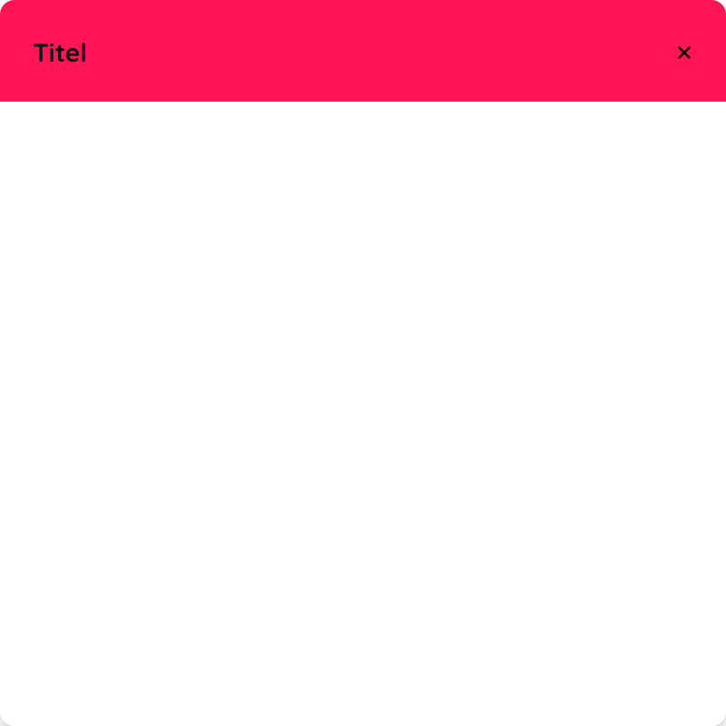
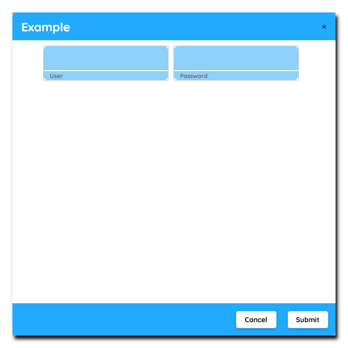
The basic structure of the yPopup shall be explained in the following. For the general structure of a yComponent please visit the YBase-components basic-structure.
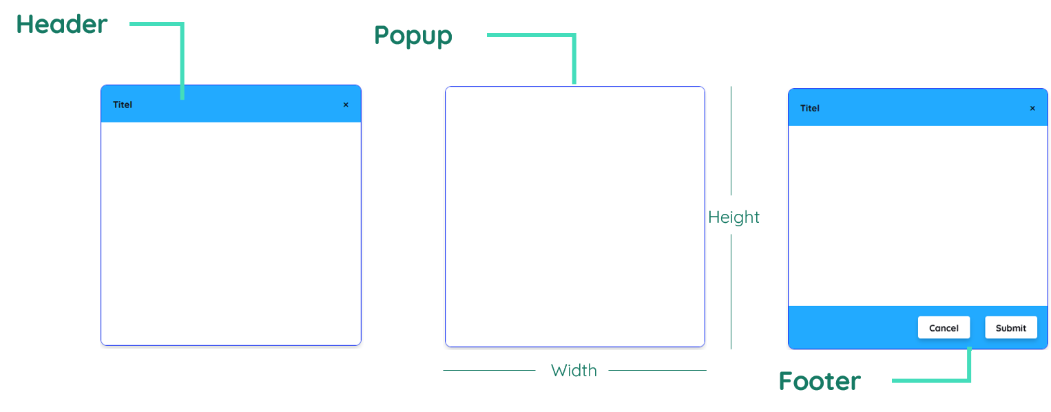
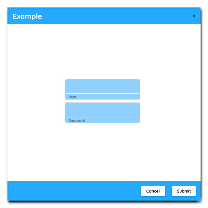
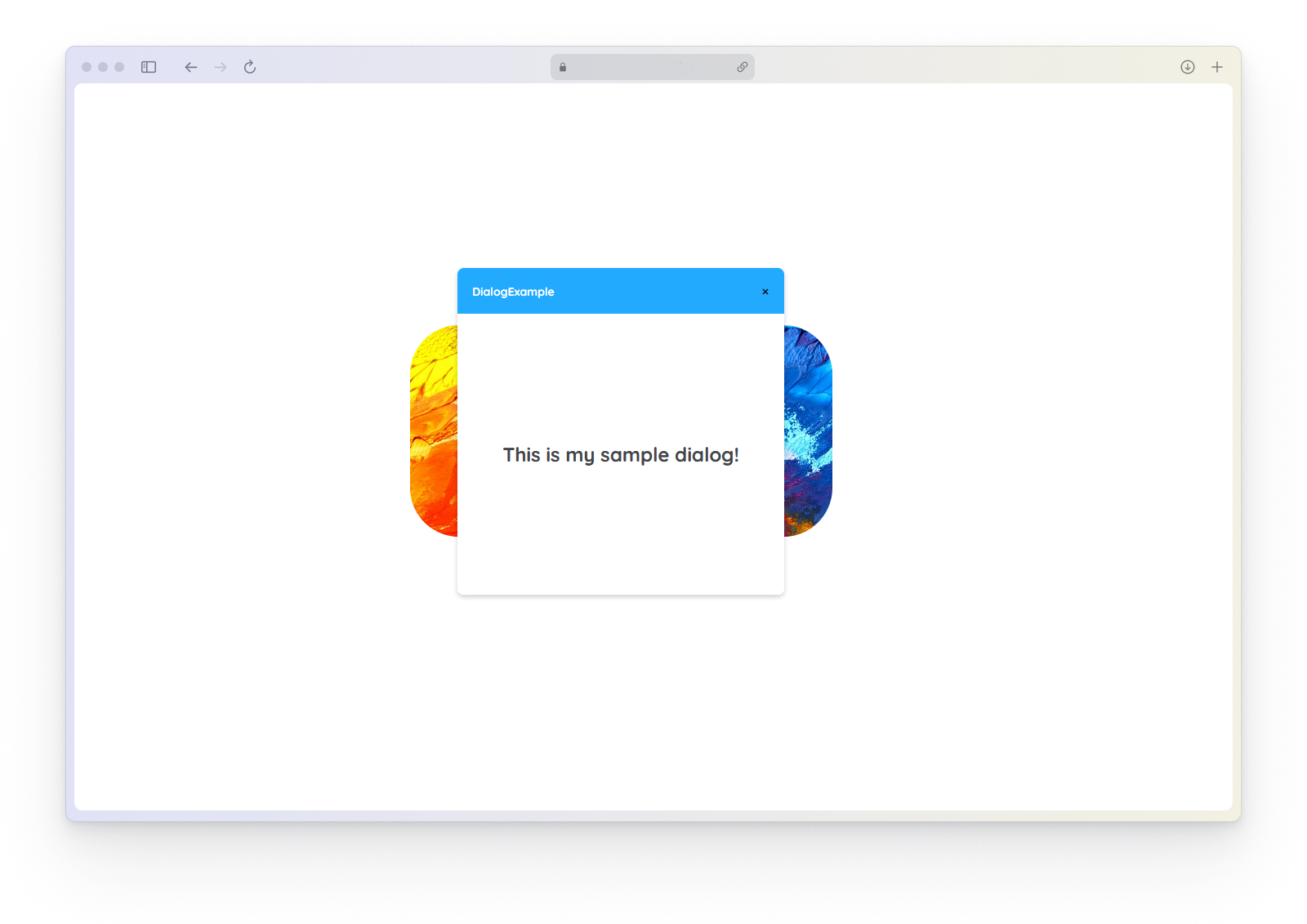
The yPopup as seen above can contain a header and footer and always includes content inbetween.
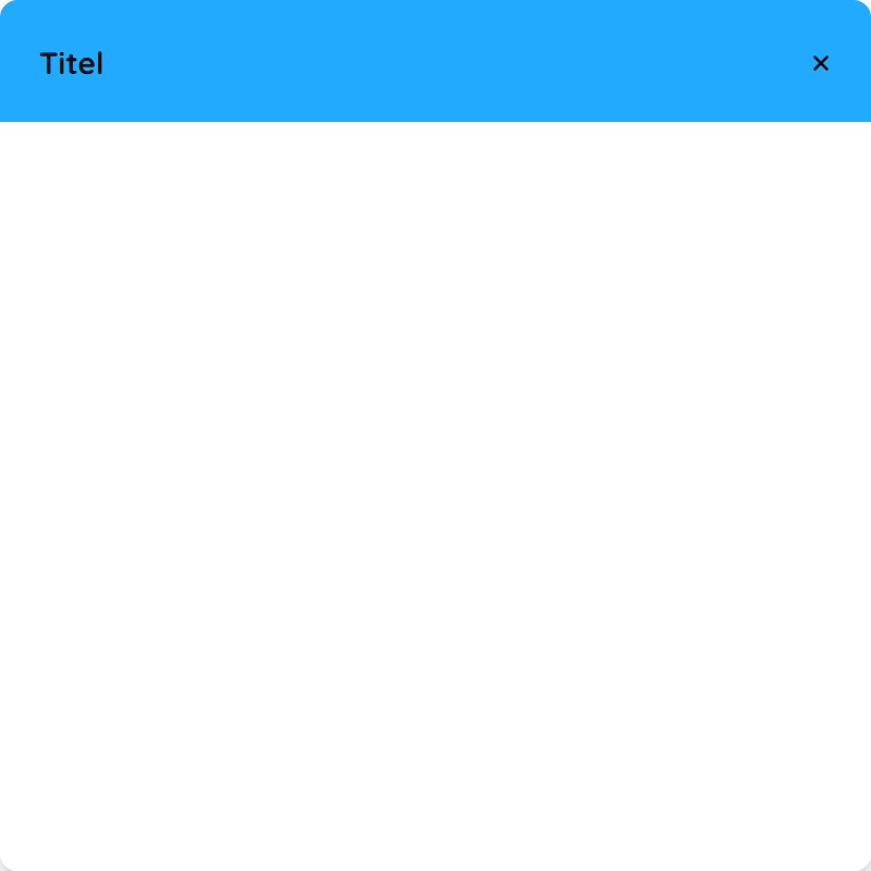
Header
The header can be toggled on/off by changing the Popup__Display-Type. It contains a title and an icon on the left side and a close button on the right.
Content
The content is the actual center of the component itself. It basically mimics a container which can be designed and filled like a yPage.
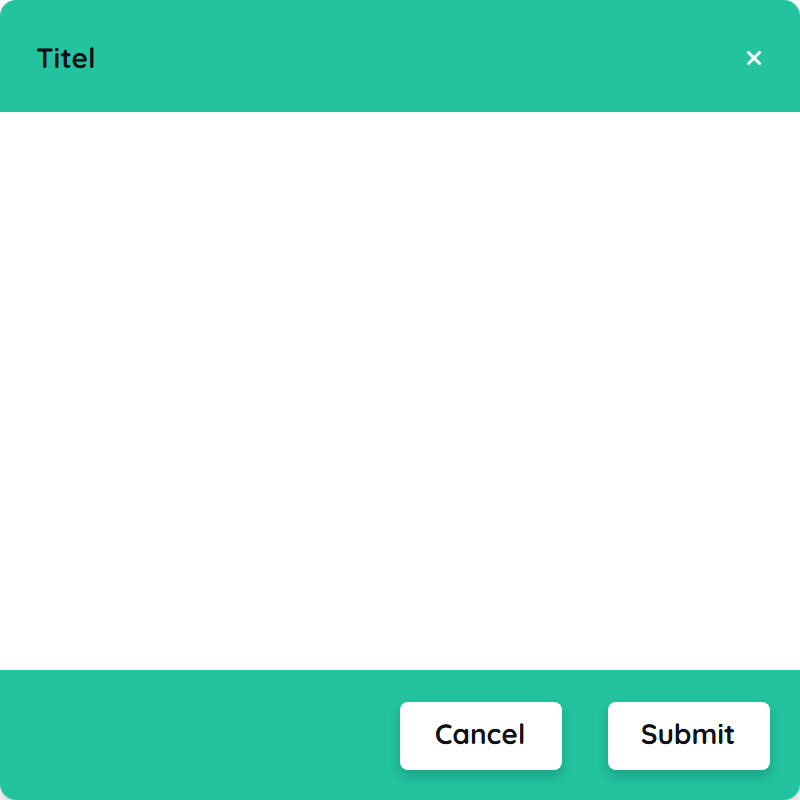
Footer
The footer as a specific submodule of the yPopup, can also be toggled equal to the header. It contains two action buttons on the right that can be modified if needed. These two buttons represent a cancel and a submit button which can trigger events.
Properties
Through its various properties the yPopup can be configured to suit your needs. The display below provides you with an overview of all the yPopup properties.
Properties can be changed directly through three methods:
- Inside the Toolbar, which is positioned in your workarea next to your component right where you need it. It shows the most important properties, thus providing a fast and efficient way to configure your component in the most basic way.
- It may also occur in the Toolbar Extension, which is a seamless extension accesible as a dropdown item of the Toolbar. It extends the functionality of the Toolbar by providing advanced pickers for the most used properties.
- Inside the Detail Panel, which is located in the righthand drawer. Every property of a component can be configured here.
- Generic
- Style
- Links
- Events
METAread more
The identifier of the component that is unique within a page.
The type of the component. For this component it is -popup.
The custom name of the component. It serves for better identification of the component.
The custom version of the Popup-component. This can be used to ensure that all components work well together.
The CoreTheme, which will be apllied to the Popup. For further information on themes visit the themes page.
The subtheme subordinated to the previously specified CoreTheme, which will be apllied to the Popup. For further information on themes visit the themes page.
The group theme is a further variation of the subtheme which is specified especially for variations of a component inside the subtheme. For further information on themes visit the Theme-Manager page.
DISPLAYread more
This property specifies the display behavior of the component. This can be be set to:
- none
- block
- flex
- inline
This property specifies the type of positioning method used for the component. This can be be set to:
- static
- relative
- absolute
- sticky
- fixed
This property can toggle the visibility of the component. The two modes are completely hidden and fully shown.
SIZEread more
The minimum value for the width of the component. This can be set in:
- px
- pt
- em
- vw
- vh
- %
The minimum value for the height of the component. This can be set in:
- px
- pt
- em
- vw
- vh
- %
The value for the width of the component. This can be set in:
- px
- pt
- em
- vw
- vh
- %
- auto
The value for the height of the component. This can be set in:
- px
- pt
- em
- vw
- vh
- %
- auto
The maximum value for the width of the component. This can be set in:
- px
- pt
- em
- vw
- vh
- %
- none
The maximum value for the height of the component. This can be set in:
- px
- pt
- em
- vw
- vh
- %
- none
The flex property sets the length on flexible items. This sets the value in n-fold shares extrapolated to all other components with the flex display within the same container.
PLACEMENTread more
This property creates a space around the component, outside of the top border. This can be set in percent or pixels.
This property creates a space around the component, outside of the right border. This can be set in percent or pixels.
This property creates a space around the component, outside of the bottom border. This can be set in percent or pixels.
This property creates a space around the component, outside of the left border. This can be set in percent or pixels.
This property creates a space within the component, inside of the top border. This can be set in percent or pixels.
This property creates a space within the component, inside of the right border. This can be set in percent or pixels.
This property creates a space within the component, inside of the bottom border. This can be set in percent or pixels.
This property creates a space within the component, inside of the top border. This can be set in percent or pixels.
BACKGROUNDread more
The color of the background. This can be set as a color from a palette or a custom hex color.
The url to the source of the file to be set as the background. This can be set to a text containing a valid url path. The path should not be to your local files (starting with e.g. C:/...), but instead to the web (starting with e.g. https://www....).
The size of the background inside of the Popup-component. This can be set to:
- auto
- cover
- contain
The position of the background inside of the Popup-component. This can be set to:
- none
- center
- left
- right
- top
- bottom
- inherit
This property specifies if the background should be repeated.
BORDERread more
The color of the top border. This can be set as a color from a palette or a custom hex color.
The style of the top border. This can be be set to:
- solid
- dotted
- dashed
- none
The width of the top border. This can be set in percent or pixels.
The color of the right border. This can be set as a color from a palette or a custom hex color.
The style of the right border. This can be be set to:
- solid
- dotted
- dashed
- none
The width of the right border. This can be set in percent or pixels.
The color of the bottom border. This can be set as a color from a palette or a custom hex color.
The style of the bottom border. This can be be set to:
- solid
- dotted
- dashed
- none
The width of the bottom border. This can be set in percent or pixels.
The color of the left border. This can be set as a color from a palette or a custom hex color.
The style of the left border. This can be be set to:
- solid
- dotted
- dashed
- none
The width of the left border. This can be set in percent or pixels.
The radius of the corners of all the borders. This can be set in percent or pixels.
SHADOWread more
The shadow of the component. This is set by the 4 sub-properties x, y, blur and spread of the shadow-property, which can be further read about in the shadow-property section.
OPACITYread more
The opacity of all colored parts of the component. This value is set in percent.
ALIGNMENTread more
This property specifies whether the flexible items in the Popup-component should wrap or not.
The direction in which the flexible items inside the Popup-component should align.
The justification of the flexible Popup-container's items when the items do not use all available space on the the main-axis (horizontally).
The default alignment for items inside the flexible Popup-container.
The justification of the flexible Popup-container's items when the items do not use all available space on the main-axis (vertically).
The default alignment for content inside the flexible Popup-container.
This property specifies the behavior, when content inside the Popup-component is wider than its parent(vertically). This can be set to:
- visible
- hidden
- scroll
- auto
This property specifies the behavior, when content inside the Popup-component is higher than its parent(horizontally). This can be set to:
- visible
- hidden
- scroll
- auto
This property specifies, whether the scrollbar should be displayed or not, while keeping scrollability.
POPUPread more
This property specifies if a popup should be shown.
This property specifies where the popup should be displayed.
This property specifies the display-type for the popup.
This property specifies the state that the popup will be in when being displayed.
The animation that will be used when displaying the popup.
The speed at which the animation for the entry of the popup will happen.
The duration that the popup-animation will need to happen.
This property specifies if the popup has to be handled first before anything else can be clicked.
The parent of the source element.
The child of the source element.
HEADERread more
The color of the font inside the header. This can be set as a color from a palette or a custom hex color.
The font-family of the header text. This can be picked from a large list of provided fonts.
The font-weight of the header text. This can be set in a custom number, as example:
- 400 = normal(regular)
- 500 = medium
- 600 = semi bold
- 700 = bold
The font-size of the header text. This can be set in: -cm
- mm
- in
- px
- em
- ex
- ch
- rem
The font-style of the header text. This can be set to normal, italic or oblique.
The text-transformation of the header text. This can be set to:
- capitalize
- uppercase
- lowercase
- none
- full-width
The font-align of the header text. This property moves the list text to the desired position, it can be set to left, center or right.
The title that will be displayed inside the header.
The icon to be shown for the prefix of the header text.
The size of the header's icon. This can be set in: -cm
- mm
- in
- px
The color of the icon inside the header. This can be set as a color from a palette or a custom hex color.
FOOTERread more
The color of the font on the left side inside the footer. This can be set as a color from a palette or a custom hex color.
The color of the font on the right side inside the footer. This can be set as a color from a palette or a custom hex color.
The font-family of the footer text. This can be picked from a large list of provided fonts.
The font-weight of the footer text. This can be set in a custom number, as example:
- 400 = normal(regular)
- 500 = medium
- 600 = semi bold
- 700 = bold
The font-size on the left side of the footer text. This can be set in: -cm
- mm
- in
- px
- em
- ex
- ch
- rem
The font-size on the right side of the footer text. This can be set in: -cm
- mm
- in
- px
- em
- ex
- ch
- rem
The font-style of the footer text. This can be set to normal, italic or oblique.
The text-transformation of the footer text. This can be set to:
- capitalize
- uppercase
- lowercase
- none
- full-width
The font-align of the footer text. This property moves the list text to the desired position, it can be set to left, center or right.
The color of the button on the left inside the footer. This can be set as a color from a palette or a custom hex color.
The color of the button on the right inside the footer. This can be set as a color from a palette or a custom hex color.
The label to be displayed for the button on the left side inside the footer.
The label to be displayed for the button on the right side inside the footer.
OPENread more
This property defines a link to another component for opening the Popup by specifying the componentId or componentName, Page, Component, ID, Event. The data from the link will represent true or false.
CLOSEread more
This property defines a link to another component for closing the Popup by specifying the componentId or componentName, Page, Component, ID, Event. The data from the link will represent true or false.
LIFECYCLEread more
This specifies the function to be called, when the Popup is initialized.
INPUTread more
The event that is triggered when editing the input field is finished. ???
The event that is triggered when the input is being closed.
Usage
In this section you will find a collection of application scenarios and examples that illustrate how to leverage the yPopup in ways that deviate from its standard behavior, as defined by yBase. This section aims to inspire and guide you through various possibilities, helping you to implement more complex or unique functionalities tailored to your specific needs. General properties that are universally applicable can be found in the yBase usage section.
Displaytype
The yPopup comes with three built-in types.

- Empty
- Header Example1
- Header & Footer
- Header Example2
- Header Example3
Popup__Persistentenables that it can't be closed by clicking away.- When enabling
Popup__Backdrop, the popup gets a backdrop added, which blurs out the back. Popup__Timedmakes the popup time based and closes it automatically afterPopup__Durationhas passed.
Background
- Cover
- Repeat
Alignment
- Row
- Column
- Wrap
If the content exceeds the parent element itself, a scrollbar will appear. When needed, this scrollbar can be removed while keeping scrollability, when toggling the property show-scrollbar to false.
Positioning
To position a yPopup, you have to choose a position inside the PositionPicker.
- Inner top center
- Outer bottom center
- Inner center center
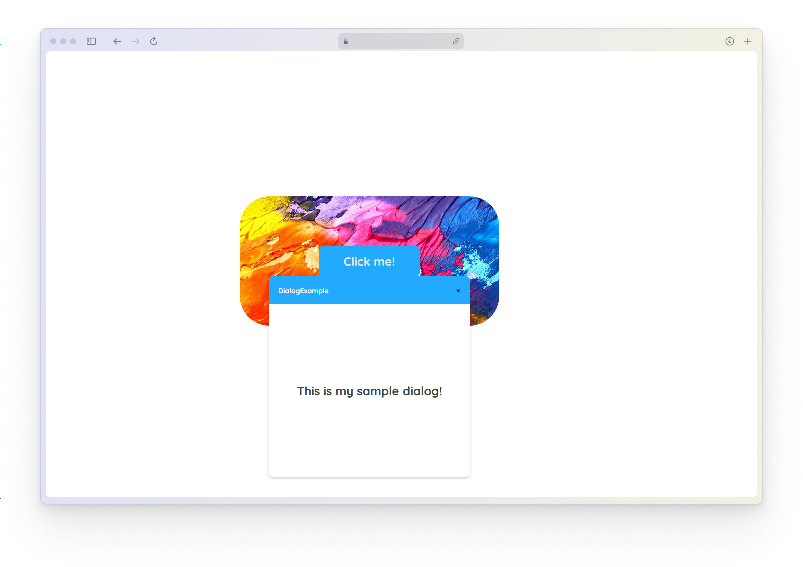
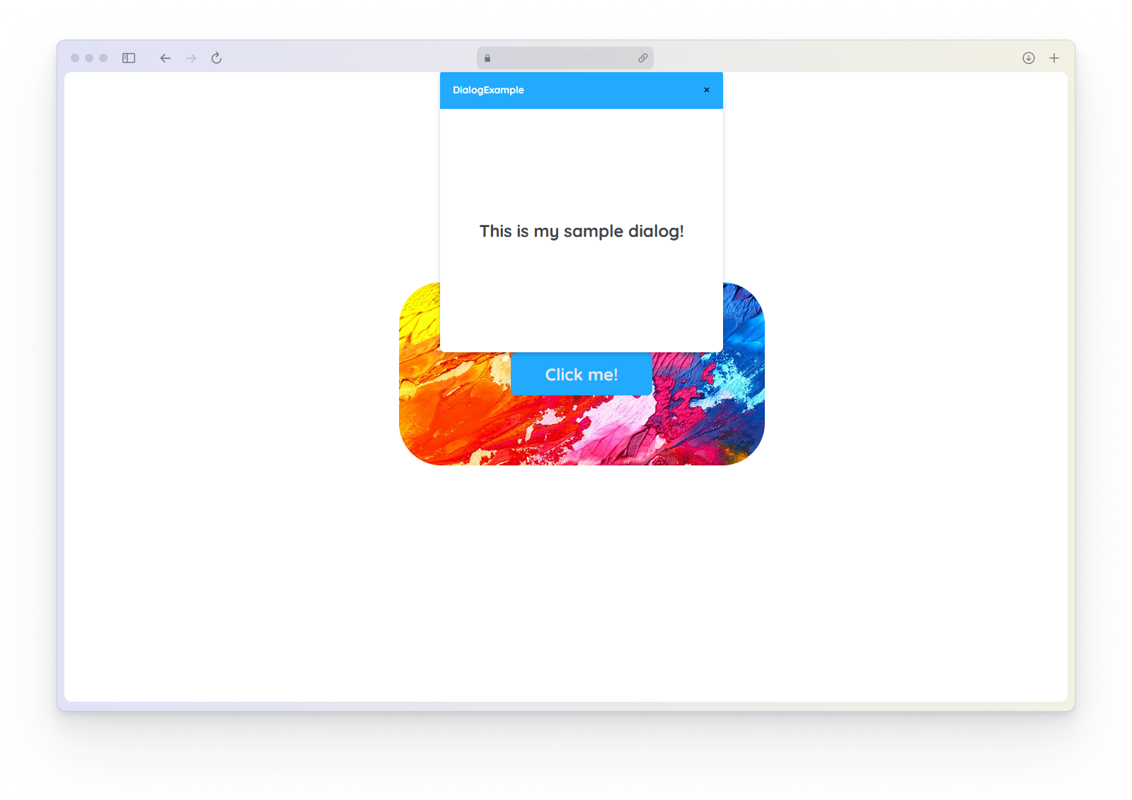
Creating SourceLink Open/Close
To display a new popup, you need to make some moves for it to be rendered.
How to:
- Create a yPage with a yButton component in your application.
- Open your yPopup again.
- Within the Detail Panel, proceed to the Links section and unfold Open.
- Create a new SourceLink for
Source-Link-Opento the yButton on the previously created yPage.
It should look like:y-page:1:y-button:2:click.
The same procedures can be done with any other trigger element and also applys for Source-Link-Close.
Using Submit and Close Event
How to:
You can use the yPopup as a modal dialog and react on user interactions such as submit and close.
- Create two yInput inside the yPopup and change their
Typeto number. - Select the yPopup again.
- Within the Detail Panel, proceed to Style section and unfold Popup.
- Change the
Popup__Display-TypetoHeader & Footer. - The proceed to the Event section and unfold Input and open
EvtSubmit.
Code example:
In this example we have a simple yPopup containing a minified calculator that can only add two values. When the user submits, we read the two input values which should be added and alert the result.
// function onPopup_1_EvtSubmit (apiObject, component, eventData) {

const inputA = apiObject.ui.getObject(1, "y-input");
const inputB = apiObject.ui.getObject(2, "y-input");

const num1 = inputA.get("style", "content", "inputNumber");
const num2 = inputB.get("style", "content", "inputNumber");

alert("result: ", num1 + num2);

// }
Using Modal Popup for Multiple Pages
How to:
You can use the yPopup universally on multiple pages inside your project.
- Open the Detail Panel and proceed to Style and unfold the group Popup.
- Change the
Popup__Display-TypetoHeader & Footer. - Create a yPage with a yButton in your application.
- Within the Detail Panel of the yButton, proceed to the Event section and open
EvtClicked.
Code example:
In this example the user can call the popupOpen function to open a certain yPopup, when a yButton is clicked.
// function onButton_5_EvtClicked (apiObject, component, eventData) {

apiObject.popup.popupOpen(1, "y-popup");

// }