yLabel
Description
The yLabel component serves as a powerful tool primarily designed for displaying short text information within your application. It's an adaptable element that allows both static and dynamic content.
With the yLabel you can display user instructions, show real-time data updates, provide context for other components, or present calculated values within a form, among other applications.
Some uses for the yLabel are:
Basic Structure
The basic structure of the yLabel shall be explained in the following. For the general structure of a yComponent please visit the YBase-components basic-structure.
Properties
Through its various properties the yLabel can be configured to suit your needs. The display below provides you with an overview of all the yLabel properties.
Properties can be changed directly through three methods:
- Inside the Toolbar, which is positioned in your workarea next to your component right where you need it. It shows the most important properties, thus providing a fast and efficient way to configure your component in the most basic way.
- It may also occur in the Toolbar Extension, which is a seamless extension accesible as a dropdown item of the Toolbar. It extends the functionality of the Toolbar by providing advanced pickers for the most used properties.
- Inside the Detail Panel, which is located in the righthand drawer. Every property of a component can be configured here.
- Generic
- Style
- Label
- Links
- Events
METAread more
The identifier of the component that is unique within a page.
The type of the component. For this component it is -label.
The custom name of the component. It serves for better identification of the component.
The custom version of the Label-component. This can be used to ensure that all components work well together.
The CoreTheme, which will be apllied to the Label. For further information on themes visit the themes page.
The subtheme subordinated to the previously specified CoreTheme, which will be apllied to the Label. For further information on themes visit the themes page.
The group theme is a further variation of the subtheme which is specified especially for variations of a component inside the subtheme. For further information on themes visit the Theme-Manager page.
DISPLAYread more
This property specifies the display behavior of the component. This can be be set to:
- none
- block
- flex
- inline
This property specifies the type of positioning method used for the component. This can be be set to:
- static
- relative
- absolute
- sticky
- fixed
This property can toggle the visibility of the component. The two modes are completely hidden and fully shown.
SIZEread more
The minimum value for the width of the component. This can be set in:
- px
- pt
- em
- vw
- vh
- %
The minimum value for the height of the component. This can be set in:
- px
- pt
- em
- vw
- vh
- %
The value for the width of the component. This can be set in:
- px
- pt
- em
- vw
- vh
- %
- auto
The value for the height of the component. This can be set in:
- px
- pt
- em
- vw
- vh
- %
- auto
The maximum value for the width of the component. This can be set in:
- px
- pt
- em
- vw
- vh
- %
- none
The maximum value for the height of the component. This can be set in:
- px
- pt
- em
- vw
- vh
- %
- none
The flex property sets the length on flexible items. This sets the value in n-fold shares extrapolated to all other components with the flex display within the same container.
PLACEMENTread more
This property creates a space around the component, outside of the top border. This can be set in percent or pixels.
This property creates a space around the component, outside of the right border. This can be set in percent or pixels.
This property creates a space around the component, outside of the bottom border. This can be set in percent or pixels.
This property creates a space around the component, outside of the left border. This can be set in percent or pixels.
This property creates a space within the component, inside of the top border. This can be set in percent or pixels.
This property creates a space within the component, inside of the right border. This can be set in percent or pixels.
This property creates a space within the component, inside of the bottom border. This can be set in percent or pixels.
This property creates a space within the component, inside of the top border. This can be set in percent or pixels.
BACKGROUNDread more
The color of the background. This can be set as a color from a palette or a custom hex color.
BORDERread more
The color of the top border. This can be set as a color from a palette or a custom hex color.
The style of the top border. This can be be set to:
- solid
- dotted
- dashed
- none
The width of the top border. This can be set in percent or pixels.
The color of the right border. This can be set as a color from a palette or a custom hex color.
The style of the right border. This can be be set to:
- solid
- dotted
- dashed
- none
The width of the right border. This can be set in percent or pixels.
The color of the bottom border. This can be set as a color from a palette or a custom hex color.
The style of the bottom border. This can be be set to:
- solid
- dotted
- dashed
- none
The width of the bottom border. This can be set in percent or pixels.
The color of the left border. This can be set as a color from a palette or a custom hex color.
The style of the left border. This can be be set to:
- solid
- dotted
- dashed
- none
The width of the left border. This can be set in percent or pixels.
The radius of the corners of all the borders. This can be set in percent or pixels.
SHADOWread more
The shadow of the component. This is set by the 4 sub-properties x, y, blur and spread of the shadow-property, which can be further read about in the shadow-property section.
OPACITYread more
The opacity of all colored parts of the component. This value is set in percent.
LABELread more
The color of the label text. This can be set as a color from a palette or a custom hex color.
The font-family of the label text. This can be picked from a large list of provided fonts.
The font-weight of the label text. This can be set in a custom number, as example:
- 400 = normal(regular)
- 500 = medium
- 600 = semi bold
- 700 = bold
The font-style of the label text. This can be set to normal, italic or oblique.
The text-transformation of the label text. This can be set to:
- capitalize
- uppercase
- lowercase
- none
- full-width
The text-decoration of the label text. This can be set to:
- strikethrough
- underline
The font-size of the label text. This can be set in: -cm
- mm
- in
- px
- em
- ex
- ch
- rem
The font-align of the label text. This property moves the label text to the desired position, it can be set to left, center or right.
The whitespaces of the label text. This can be set to:
- normal
- nowrap
- pre
- pre-wrap
- pre-line
- break-spaces
The actual written text in the label. There is no limit to the number of characters.
STATEread more
This property can disable or enable the disabled-state of the Label-component.
LABELread more
This property defines a link to another component by specifying the componentId or componentName, Page, Component, ID, Event. The data from the link will represent the label to be displayed.
Usage
In this section you will find a collection of application scenarios and examples that illustrate how to leverage the yLabel in ways that deviate from its standard behavior, as defined by yBase. This section aims to inspire and guide you through various possibilities, helping you to implement more complex or unique functionalities tailored to your specific needs. General properties that are universally applicable can be found in the yBase usage section.
Variations
- Elevated
- Flat
- Outlined
- Rounded
- Plain
Linking Input Elements
You can establish a connection between the yLabel component and another component using a SourceLink Picker. In this example, the yLabel component is linked to a yInput component. Whenever the value in the yInput is changed, the connected yLabel component will update accordingly.
How to:
- Open the Detail Panel and go to the Links tab to unfold the Label section.
- Select the previously created yInput and create a new SourceLink, which should look something like:
y-page:1:y-input:2:input-string.
That's it! You can now test this functionality by entering the preview mode and typing the desired text into the yInput component. The yLabel component should update accordingly.
If you want to include text before or after the input value, you can add it in Style > Label > Label. To display the input value, use {value} as a placeholder.
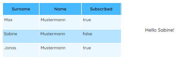
Displaying Table Data
You can also establish a connection between the yLabel component and the yTable via SourceLink. In this example, the yLabel component is linked to specific column of the yTable. Whenever the selected row changes, the yLabel will update accordingly.
How to:
- Create a yTable in your application.
- Open the Detail Panel of the yLabel and navigate to Links to unfold the Label group to edit
Source-Label. Now, there are two options: - Change Style > Label >
Label. Here, you also have the option to include custom text, like this template-string: Hello {value}!".
Now, in the preview mode, when you click on a row in the yTable, the yLabel component will update accordingly.