yInput
Description
The yInput is an element that allows user input. This yInput can be furhter used for example for:
- Asking user information like a username with custom validation
- Applying a custom mask
- Using a debounce
- Let the browser read input text
Basic Structure
The basic structure of the yInput shall be explained in the following. For the general structure of a yComponent please visit the YBase-components basic-structure.
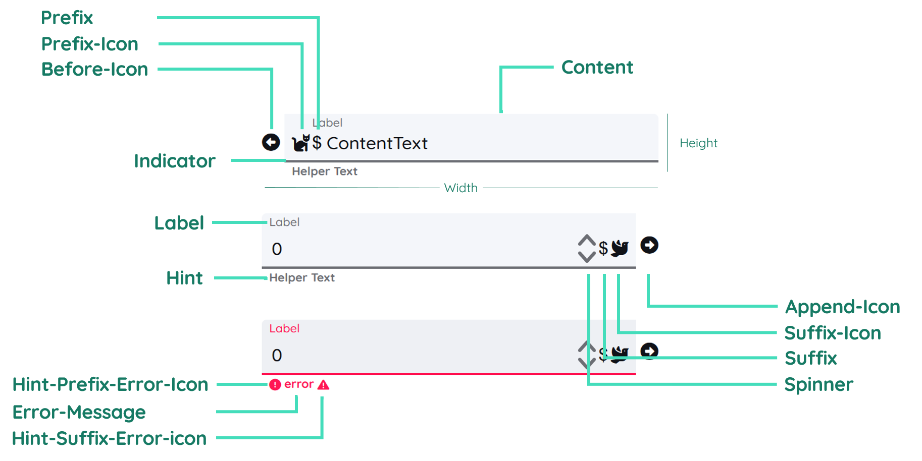
The yInput as seen above contains a label and a helper text and includes multiple icons and more.
Label
The label contains the text inside the button. It is on the right side of the component. By changing the inner padding of the button, the label gets moved too. You can find further explanation at the Label Property.
Hint
The Hint is similar to the label and displays a hint related to the input that will be expected. In certain situations the helper text will be replaced by a warning or error text, which can either be set through the automatic validation or custom scripts.
Properties
Through its various properties the yInput can be configured to suit your needs. The display below provides you with an overview of all the yInput properties.
Properties can be changed directly through three methods:
- Inside the Toolbar, which is positioned in your workarea next to your component right where you need it. It shows the most important properties, thus providing a fast and efficient way to configure your component in the most basic way.
- It may also occur in the Toolbar Extension, which is a seamless extension accesible as a dropdown item of the Toolbar. It extends the functionality of the Toolbar by providing advanced pickers for the most used properties.
- Inside the Detail Panel, which is located in the righthand drawer. Every property of a component can be configured here.
- Generic
- Style
- Input
- Links
- Events
METAread more
The identifier of the component that is unique within a page.
The type of the component. For this component it is -input.
The custom name of the component. It serves for better identification of the component.
The custom version of the Input-component. This can be used to ensure that all components work well together.
The CoreTheme, which will be apllied to the Input. For further information on themes visit the themes page.
The subtheme subordinated to the previously specified CoreTheme, which will be apllied to the Input. For further information on themes visit the themes page.
The group theme is a further variation of the subtheme which is specified especially for variations of a component inside the subtheme. For further information on themes visit the Theme-Manager page.
DISPLAYread more
This property specifies the display behavior of the component. This can be be set to:
- none
- block
- flex
- inline
This property specifies the type of positioning method used for the component. This can be be set to:
- static
- relative
- absolute
- sticky
- fixed
This property can toggle the visibility of the component. The two modes are completely hidden and fully shown.
SIZEread more
The minimum value for the width of the component. This can be set in:
- px
- pt
- em
- vw
- vh
- %
The minimum value for the height of the component. This can be set in:
- px
- pt
- em
- vw
- vh
- %
The value for the width of the component. This can be set in:
- px
- pt
- em
- vw
- vh
- %
- auto
The value for the height of the component. This can be set in:
- px
- pt
- em
- vw
- vh
- %
- auto
The maximum value for the width of the component. This can be set in:
- px
- pt
- em
- vw
- vh
- %
- none
The maximum value for the height of the component. This can be set in:
- px
- pt
- em
- vw
- vh
- %
- none
The flex property sets the length on flexible items. This sets the value in n-fold shares extrapolated to all other components with the flex display within the same container.
PLACEMENTread more
This property creates a space around the component, outside of the top border. This can be set in percent or pixels.
This property creates a space around the component, outside of the right border. This can be set in percent or pixels.
This property creates a space around the component, outside of the bottom border. This can be set in percent or pixels.
This property creates a space around the component, outside of the left border. This can be set in percent or pixels.
This property creates a space within the component, inside of the top border. This can be set in percent or pixels.
This property creates a space within the component, inside of the right border. This can be set in percent or pixels.
This property creates a space within the component, inside of the bottom border. This can be set in percent or pixels.
This property creates a space within the component, inside of the top border. This can be set in percent or pixels.
BACKGROUNDread more
The color of the background. This can be set as a color from a palette or a custom hex color.
BORDERread more
The color of the top border. This can be set as a color from a palette or a custom hex color.
The style of the top border. This can be be set to:
- solid
- dotted
- dashed
- none
The width of the top border. This can be set in percent or pixels.
The color of the right border. This can be set as a color from a palette or a custom hex color.
The style of the right border. This can be be set to:
- solid
- dotted
- dashed
- none
The width of the right border. This can be set in percent or pixels.
The color of the bottom border. This can be set as a color from a palette or a custom hex color.
The style of the bottom border. This can be be set to:
- solid
- dotted
- dashed
- none
The width of the bottom border. This can be set in percent or pixels.
The color of the left border. This can be set as a color from a palette or a custom hex color.
The style of the left border. This can be be set to:
- solid
- dotted
- dashed
- none
The width of the left border. This can be set in percent or pixels.
The radius of the corners of all the borders. This can be set in percent or pixels.
SHADOWread more
The shadow of the component. This is set by the 4 sub-properties x, y, blur and spread of the shadow-property, which can be further read about in the shadow-property section.
OPACITYread more
The opacity of all colored parts of the component. This value is set in percent.
LABELread more
The color of the label text. This can be set as a color from a palette or a custom hex color.
The font-family of the label text. This can be picked from a large list of provided fonts.
The font-weight of the label text. This can be set in a custom number, as example:
- 400 = normal(regular)
- 500 = medium
- 600 = semi bold
- 700 = bold
The font-style of the label text. This can be set to normal, italic or oblique.
The text-transformation of the label text. This can be set to:
- capitalize
- uppercase
- lowercase
- none
- full-width
The text-decoration of the label text. This can be set to:
- strikethrough
- underline
The font-size of the label text. This can be set in: -cm
- mm
- in
- px
- em
- ex
- ch
- rem
The actual written text in the label. There is no limit to the number of characters.
CONTENTread more
The type of the content that is to be set.
The color of the content background. This can be set as a color from a palette or a custom hex color.
The font-color of the text-content inside the Input-component.
The font-family of the text-content inside the Input-component.
The font-weight of the text-content inside the Input-component.
The font-style of the text-content inside the Input-component.
The text-transformation of the content text. This can be set to:
- capitalize
- uppercase
- lowercase
- none
- full-width
The text-decoration of the content text. This can be set to:
- strikethrough
- underline
The font-size of the text-content inside the Input-component.
The font-align of the content text. This property moves the content text to the desired position, it can be set to left, center or right.
This property creates a space within the component, inside of the left and right border. This can be set in percent or pixels.
This property creates a space around the content of the Input-component, outside of the bottom border. This can be set in percent or pixels.
This property creates a space around the content of the Input-component, outside of the top border. This can be set in percent or pixels.
The (formatted) displayed value of the Input(e.g. '+49 151 123 345 67' displayed instead of real value '15112334567').
The text to be set as the value for the content of the Input-component.
The maximum value for the length.
The number to be set as the value for the content of the Input-component.
The value for steps of the spinner. This specifies how much the value increases or decreases when clicking up or down on the spinner.
The number of decimal places that are allowed.
This property specifies if buttons should be allowed.
PLACEHOLDERread more
The color of the placeholder text. This can be set as a color from a palette or a custom hex color.
The font-family of the placeholder text. This can be picked from a large list of provided fonts.
The font-weight of the placeholder text. This can be set in a custom number, as example:
- 400 = normal(regular)
- 500 = medium
- 600 = semi bold
- 700 = bold
The font-style of the placeholder text. This can be set to normal, italic or oblique.
The text-transformation of the placeholder text. This can be set to:
- capitalize
- uppercase
- lowercase
- none
- full-width
The text-decoration of the placeholder text. This can be set to:
- strikethrough
- underline
The font-size of the placeholder text. This can be set in: -cm
- mm
- in
- px
- em
- ex
- ch
- rem
The font-align of the placeholder text. This property moves the placeholder text to the desired position, it can be set to left, center or right.
The placeholder-text to be displayed as a placeholder.
HINTread more
The color of the hint text. This can be set as a color from a palette or a custom hex color.
The font-family of the hint text. This can be picked from a large list of provided fonts.
The font-weight of the hint text. This can be set in a custom number, as example:
- 400 = normal(regular)
- 500 = medium
- 600 = semi bold
- 700 = bold
The font-style of the font-style text. This can be set to normal, italic or oblique.
The text-transformation of the hint text. This can be set to:
- capitalize
- uppercase
- lowercase
- none
- full-width
The text-decoration of the hint text. This can be set to:
- strikethrough
- underline
The font-size of the hint text. This can be set in: -cm
- mm
- in
- px
- em
- ex
- ch
- rem
The font-align of the hint text. This property moves the hint text to the desired position, it can be set to left, center or right.
The icon to be shown for the prefix of the hint text.
The icon to be shown for the suffix of the hint text.
The hint that is going to be displayed.
PREFIXSUFFIXread more
The color of the prefix and suffix text. This can be set as a color from a palette or a custom hex color.
The color of the icon inside the prefix and suffix text. This can be set as a color from a palette or a custom hex color.
The font-size of the prefix and suffix text. This can be set in: -cm
- mm
- in
- px
- em
- ex
- ch
- rem
The icon to be shown before the Input's input-field.
The icon to be shown behind the Input's input-field.
The icon to be shown for the prefix of the Input's input-text.
The icon to be shown for the suffix of the Input's input-text.
The string to be displayed in front of the Input's value.
The string to be displayed behind the Input's value.
SPINNERread more
The color of the spinner background. This can be set as a color from a palette or a custom hex color.
The color of the icon inside the spinner. This can be set as a color from a palette or a custom hex color.
The icon to be shown as the arrow-up-symbol of the spinner.
The icon to be shown as the arrow-down-symbol of the spinner.
INDICATORread more
The color of the indicator. This can be set as a color from a palette or a custom hex color.
The height of the indicator. This can be set in:
- px
- pt
- em
- vw
- vh
- %
- auto
STATEread more
This property can disable or enable the disabled-state of the Input-component.
This property can disable or enable the error-state of the Input-component.
This property can disable or enable the readonly-state of the Input-component.
ERRORread more
The message to be displayed, if an error occurs.
MISCread more
The time that has to pass before the action can be called again.
This property specifies if the value should be clearable or not.
This option will specify if the restriction for content should be dense or not.
VALIDATIONread more
The mask to be used for the Input's restrictions for content.
This property specifies a list of validation expressions. (e.g. != 0 meaning not equals zero)
LABELread more
This property defines a link to another component by specifying the componentId or componentName, Page, Component, ID, Event. The data from the link will represent the label to be displayed.
CONTENTread more
This property defines a link to another component by specifying the componentId or componentName, Page, Component, ID, Event. The data from the link will represent the content-text to be displayed.
HINTread more
This property defines a link to another component by specifying the componentId or componentName, Page, Component, ID, Event. The data from the link will represent the hint-text to be displayed.
LIFECYCLEread more
This specifies the function to be called, when the Input is initialized.
INPUTread more
The event that is triggered when the text inside the input field is being editet.
The event that is triggered when triggering a key of the keyboard while having the input focused.
Usage
In this section you will find a collection of application scenarios and examples that illustrate how to leverage the yInput in ways that deviate from its standard behavior, as defined by yBase. This section aims to inspire and guide you through various possibilities, helping you to implement more complex or unique functionalities tailored to your specific needs. General properties that are universally applicable can be found in the yBase usage section.
Variations
- Elevated
- Flat
- Outlined
- Rounded
- Plain
Special Variations
Beyond standard configurations, the yInput allows for advanced customization. Tailor the component for specific needs like user feedback forms with character limits or code input areas with monospace font styling.
- Numeric Context
- Textual Input
- No Label, Placeholder
- Prefix & Suffix
- Prefix Icon
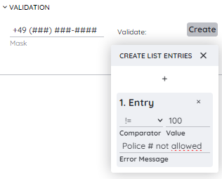
Mask and Validation
In the Component > Validation group, you will find the mask and validate properties.
mask controls the built-in Maska behavior, and validate allows you to add custom validation to the input.
Using Maska in our input component lets you define input masks as strings, so you can enforce specific formats like phone numbers or birthdays. To define a mask, simply provide a string that represents the desired format. For example, a mask for a German phone number could look like:
+49 (###) ###-####
Here, # acts as a digit placeholder. This ensures that users always enter phone numbers in a consistent format, improving data quality and reducing input errors.
In addition, the component provides a validation picker, accessible via the plus icon in the validation group. There you can:
- choose a comparator (e.g. equals, not equal, greater than, …)
- define a value to compare against
- specify a custom error message
If the validation fails, the error message is shown instead of the usual hint, giving users immediate and clear feedback about what went wrong. This makes your inputs both more robust and more user-friendly, as users are guided toward valid data entry.
Debounce
The Debounce property in the Component > Misc group is a powerful way to improve performance and user experience by controlling how often a function is executed.
When events fire rapidly (for example while typing in a search field or during window resize), debounce adds a delay in milliseconds. The function is only executed after the last event if no new event occurs within that delay. If another event happens before the delay has passed, the timer is reset. This significantly reduces redundant function calls, calculations, and API requests.
How to:
- Open the Detail Panel.
- Go to Component, expand Misc, and adjust the
debouncevalue.
A common use case is live search: Instead of sending a request on every keystroke, the search is triggered only once the user stops typing for the configured debounce time. This lowers server load and makes the UI feel smoother.
Custom Validation
The yInput can be customized to use a custom validation value for user input and restrict the allowed values, besides using the in-built validation.
How to:
- Open the Detail Panel and proceed to Events, unfold Input and modify
EvtChanged. - Insert the code down below.
Code example:
The example down below applies a custom validation for input values.
// function onInput_2_EvtChanged (apiObject, component, eventData) {

const userName = eventData.data.trim();

if (userName.length < 3) {
  alert("The username must be at least 3 characters long.");
  return false;
} else if (/[^a-zA-Z0-9]/.test(userName)) {
  alert("The username can only contain alphanumeric characters.");
  return false;
}

console.log("Username is valid.");
return true;
//}
Read input text
You can use your browser to speak. Basically you can use the text of an input field, to be read.
How to:
- Open the Detail Panel and proceed to Events, unfold Input and modify
EvtChanged. - Insert the code down below.
Code example:
The example down below sends the input text to the Speech API and lets the browser read it.
// async function onInput_2_EvtChanged (apiObject, component, eventData) {

const inputText = eventData.data;

await apiObject.speech.loadVoices();

apiObject.speech.speak(inputText);
//}